Economic valuation
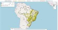
This map shows the economic value for each cell in the Amazon Forest. User can select different parameters and see results in real-time. In this simulation many products are analysed together including timber harvesting, biodiversity, costs of fire, losses on soy cultivation, livestock, carbon stocks and others due to deforestation, as a means to value the ecosystem services provided by the Amazon forests as explained in the project http://amazones.info/.
Reference: the parameters used here
Generated from the platform source. Every entry, searchable, is in the API reference; the raw data is api.json. Open an entry for its description, parameters and example; # links to it.
slider · number or range (input)
Slider17 entriesWritten in a layer's descriptionHtml as {{slider|parameter=value|...}}
backgroundColors
Array.<String># Array of colors of background slider values, to define background slider color based in slider value.
backgroundColorsArray of colors of background slider values, to define background slider color based in slider value. The values are defined from most to minimum with two properties each:
- color: {String} CSS color definition for the current interval. i.e. 'red','black','#FF0000', '#000000'.
- startValue: {Numeric} If defined define the initial value which above will apply this color, otherwise use theminimum slider value as default.
Ex.:
backgroundColors: [
{
// Define background color to red when slider has value above 75.
color: "red",
startValue: 75
},
{
// Define background color starting from value 0.
// That results two intervals, from 0 to 75 as blue, and from 76 to 100 as red.
color: "blue",
startValue: 0
}
]
cls
String# Extra CSS class(es) added to the slider element (appended to the default clickable).
clsExtra CSS class(es) added to the slider element (appended to the default clickable).
|cls=my_slider|disabled
Boolean= false# Set true to render the slider disabled (Ext disabled); enable it later with Ext.getCmp(id).enable().
disabledSet true to render the slider disabled (Ext disabled); enable it later with Ext.getCmp(id).enable().
|disabled=true|fieldLabel
String# Defines the label shown at the left of the slider (Ext fieldLabel).
fieldLabelDefines the label shown at the left of the slider (Ext fieldLabel).
|fieldLabel=Deforestation (%)|getValue
function() : Number# Returns the current value of a single-thumb slider.
getValueReturns the current value of a single-thumb slider. Call it on the component (Ext.getCmp(id) or a getid= reference), not on inputs.id[ID], which already holds the plain value.
Returns The current slider value.
var v = Ext.getCmp('deforestation_slider').getValue();getValues
function() : Array.<Number># Returns the value of every thumb; use it for range sliders created with values=[lo, hi].
getValuesReturns the value of every thumb; use it for range sliders created with values=[lo, hi].
Returns One value per thumb, in thumb order.
var range = Ext.getCmp('interval_slider').getValues(); // [lo, hi]gradient
Boolean= false# Set true to blend the backgroundColors into a continuous gradient along the filled part of the slider (each colour fading into the next from its startValue).
gradientSet true to blend the backgroundColors into a continuous gradient along the filled part of the slider (each colour fading into the next from its startValue). With the default false each interval is a solid colour, with a short blend only around the thumb. Has no effect without backgroundColors.
|backgroundColors=[{color: "green", startValue: 0}, {color: "red", startValue: 50}]|gradient=true|hideLabel
Boolean= false# Set true to hide the label and the space reserved for it (Ext hideLabel).
hideLabelSet true to hide the label and the space reserved for it (Ext hideLabel).
|hideLabel=true|id
String# Defines the id to identify the object.
idDefines the id to identify the object.
|id=example_slider|increment
Number# Defines the step of each increment or decrement in the actual value of the slider when being dragged.
incrementDefines the step of each increment or decrement in the actual value of the slider when being dragged.
|increment = 10|maxValue
Number# Defines the maximum value of the slider.
maxValueDefines the maximum value of the slider.
|maxValue = 100|minValue
Number# Defines the minimum value of the slider.
minValueDefines the minimum value of the slider.
|minValue = 0|setValue
function(value, animate)# Sets the slider value from code.
setValueSets the slider value from code. Firing the change event (the default) also updates inputs.id[ID] and recalculates the layer. For a range slider pass the thumb index first: setValue(index, value).
- value Number
- New value (clamped to
minValue/maxValue). - animate Boolean
- Set false to move the thumb without animation.
Ext.getCmp('deforestation_slider').setValue(20);thumbStyle
String= null# Defines extra CSS class(es) added to the slider thumb (the draggable handle), to restyle it.
thumbStyleDefines extra CSS class(es) added to the slider thumb (the draggable handle), to restyle it.
|thumbStyle=x-slider-thumb-cut|value
Number# Defines the initial value of the slider (default 100).
valueDefines the initial value of the slider (default 100).
At runtime the same value is what inputs.id[ID] (and inputs[i]) holds in beforeCalc/expression: a number, or an array [lower, upper] when the values range form is used. The layer recalculates on the slider change event (thumb released or value set from code).
|value = 100|beforeCalc: function(inputs) {
var threshold = inputs.id['deforestation_slider']; // number
}values
Array.<Number># Defines the slider interval limits.
valuesDefines the slider interval limits. If defined, the slider will be displayed as a range slider. It's return at the 'inputs' parameter will be a array of two values.
|values = [0, 250]||beforeCalc: function(inputs) {
let lowerValue = inputs[0][0]; // The value of the left drag
let upperValue = inputs[0][1]; // The value of the right drag
}|width
Number# Defines the slider width in pixels.
widthDefines the slider width in pixels. Any other Ext.slider.SingleSlider config (cls, fieldLabel, hideLabel, disabled, style, keyIncrement...) is also passed through unchanged.
|width=200|label · text
Label6 entriesWritten in a layer's descriptionHtml as {{label|parameter=value|...}}
Usage: {{label|}}
cls
String# Extra CSS class(es) added to the <label> element.
clsExtra CSS class(es) added to the <label> element.
{{label|cls=slider_label|text=0%}}forId
String# Defines the id of the form field the label is for (rendered as the for attribute of the <label>), so clicking the label focuses that field.
forIdDefines the id of the form field the label is for (rendered as the for attribute of the <label>), so clicking the label focuses that field.
{{label|text=Price (US$)|forId=soy_value}}{{textfield|id=soy_value|isnumeric}}html
String# Defines the content of the label as raw HTML (not escaped).
htmlDefines the content of the label as raw HTML (not escaped). Everything after html= up to the next | is the value, so it may contain = characters. text wins when both are given.
{{label|cls=slider_label|html=0% <b>...</b> 100%|id=scale_label}}id
String# Defines the id of the label component (Ext.getCmp(id)), needed to change its text from code or to reference it with getid= in another tag.
idDefines the id of the label component (Ext.getCmp(id)), needed to change its text from code or to reference it with getid= in another tag. Generated when omitted.
{{label|id=deforestation_label|text=20%}}style
String# Inline CSS applied to the <label> element.
styleInline CSS applied to the <label> element. Any other Ext.form.Label/Ext.Component config (hidden, width...) is passed through unchanged.
{{label|text=Total|style=font-weight: bold; color: #336699;}}text
String# Defines the text of the label.
textDefines the text of the label. It is HTML-escaped, so use html when markup is needed. Update it later with Ext.getCmp(id).setText(text) (typically from an on_change= listener of a slider or textfield through getid=).
{{label|id=deforestation_label|text=Deforestation: 20%}}textfield · text box (input)
Textfield9 entriesWritten in a layer's descriptionHtml as {{textfield|parameter=value|...}}
Usage: '{{textfield}}'
afteredit
Event# Event fired once the field loses focus (blur) and its text differs from the value it had when editing started; the listener receives the TextField.
aftereditEvent fired once the field loses focus (blur) and its text differs from the value it had when editing started; the listener receives the TextField. Unlike keyup it fires a single time per edit, so use it for expensive reactions. Attach it with on_afteredit= through a getid= reference, or from code with Ext.getCmp(id).on('afteredit', fn).
{{textfield|id=soy_value|isnumeric}}{{label|getid=soy_value|getid=on_afteredit=console.log(this.getRawValue())}}Ext.getCmp('soy_value').on('afteredit', function(field) { console.log(field.getRawValue()); });fieldLabel
String# Defines the TextField label.
fieldLabelDefines the TextField label.
|fieldLabel = This is the field label|getRawValue
function() : String# Returns the text currently in the field, unprocessed (this is what inputs.id[ID] holds).
getRawValueReturns the text currently in the field, unprocessed (this is what inputs.id[ID] holds). Call it on the component (Ext.getCmp(id)).
Returns The raw text of the input element.
var text = Ext.getCmp('soy_value').getRawValue();hideLabel
Boolean= false# Defines if it should completely hide the label element (label and separator) of the TextField.
hideLabelDefines if it should completely hide the label element (label and separator) of the TextField. That is, if this property is set to true, the label will be hidden. Otherwise, the label will be shown by default. PS: Since the label will be shown by default, even if you do not specify a fieldLabel, the space for it will still be reserved so that the TextField will line up with other fields that do have labels. This space will be removed if you define it to be hidden.
|hideLabel = true|id
String# Defines the id to identify the object.
idDefines the id to identify the object.
|id=example_text_field|isnumeric
boolean# Defines the TextField content as numeric only.
isnumericDefines the TextField content as numeric only.
|isnumeric=true|setRawValue
function(value)# Replaces the text of the field from code.
setRawValueReplaces the text of the field from code. It does not fire keyup, so call forceRecalc() on an InputManager (or fire the event) when the layer must be recalculated with the new text.
- value String
- New text for the field.
Ext.getCmp('soy_value').setRawValue('43');style
String# Defines the TextField style properties.
styleDefines the TextField style properties. You can use CSS style rules to customize it.
|style = color:black;|value
String# Defines the initial value to the TextField content.
valueDefines the initial value to the TextField content.
At runtime inputs.id[ID] (and inputs[i]) holds the current text exactly as typed (getRawValue(), always a string — convert it with parseFloat when isnumeric is used). The layer recalculates on every keyup (each keystroke); the widget also fires afteredit when the field loses focus with a changed value.
|value = text|beforeCalc: function(inputs) {
var price = parseFloat(inputs.id['soy_value']) || 0;
}Link parameters (?name=value)
URLProperties1 entryvisiblelayers
Number|String= customlink parameter# How many layers start visible.
visiblelayersWritten as ?visiblelayers=
How many layers start visible. When the parameter is present it overrides the 'visibility' of every layer: all layers start hidden, then this many are turned on, counted in query order.
A positive number N: the first N layers of the query start visible.
A negative number -N: the last N layers start visible.
0: no layer starts visible.
custom: the same as leaving the parameter out: each layer's own 'visibility' decides.
Leaving it out (the default) lets each layer's 'visibility' decide; options=onlyfirstvisible is the same as visiblelayers=1. Any other text, null included, hides every layer.
// Example of query in visualization mode
// If the Layer has 3 Layers in the order: Layer1, Layer2 and Layer3,
// By setting 'visibelayers=2', the FIRST two Layers will start visible
// That is, the Layer1 and Layer2 will start visible
https://maps.csr.ufmg.br/calculator/?queryid=<query_id>&visiblelayers=2
// Example of query in edit mode
// If the Layer has 3 Layers in the order: Layer1, Layer2 and Layer3
// By setting 'visiblelayers=-2', the LAST two Layers will start visible
// That is, the Layer3 and Layer2 will start visible
https://maps.csr.ufmg.br/editor/?queryid=<query_id>&visiblelayers=-2// Example of query in edit mode
// By setting 'visiblelayers=0', no Layer will start visible when the map loads
https://maps.csr.ufmg.br/editor/?queryid=<query_id>&visiblelayers=0// Example of query in visualization mode
// By setting 'visiblelayers=custom', the Layers will start visible based on
// its 'visibility' property. Only if 'visibility: true', the Layer will start visible
https://maps.csr.ufmg.br/calculator/?queryid=<query_id>&visiblelayers=customLayer properties
LayersProperties3 entrieslegendTitle
String= string.emptyproperty# Defines the text that will be displayed at the top of the 'legendhtml tool' declared at the 'descriptionHtml' property
legendTitleDefines the text that will be displayed at the top of the 'legendhtml tool' declared at the 'descriptionHtml' property
[
  {
     title: 'Example custom legend title',
     color: '#FFA500',
     elements: [
        {
           title: 'Map of the geology in Brazil',
           name: 'CSR:geologia',
           source: 'calculate',
           visibility: true,
           legendTitle: 'This is a custom legend title',
           descriptionHtml:
              '{{legendhtml}}',
        },
     ],
  },
]
priority
Number= 0property# Defines the order of which map will be rendered on top of the others.
priorityDefines the order of which map will be rendered on top of the others. Layers with higher 'priority' will always be rendered on top of the layers with lower 'priority'.
[
  {
     title: 'At the bottom will be the geology, then the states and at top the rivers',
     color: '#FFA500',
     elements: [
        {
           title: 'Map of the states in Brazil',
           name: 'CSR:estados',
           source: 'local',
           priority: 2,
           visibility: true,
        },
        {
           title: 'Map of the rivers in Brazil',
           name: 'CSR:rios_principais',
           source: 'local',
           priority: 3,
           visibility: true,
        },
        {
           title: 'Map of the geology in Brazil',
           name: 'CSR:geologia',
           source: 'local',
           priority: 1,
           visibility: true,
        },
     ],
  },
]
title
String= 'layer_name' The default value is the layer name.property# Defines the Title that will be displayed at the Legend Window in the top left corner of the screen and inside the Group List at the top center of the screen.
titleDefines the Title that will be displayed at the Legend Window in the top left corner of the screen and inside the Group List at the top center of the screen.
[
  {
     title: 'The title of the Group shows up at the top center of the screen and has a List inside it.',
     color: '#FFA500',
     elements: [
        {
           title: 'The title of the Layer is shown at the Legend Window and inside the menu of the Group name.',
           name: 'CSR:capitals',
           visibility: true,
        },
     ],
  },
]