Layer panel buttons

Quick start

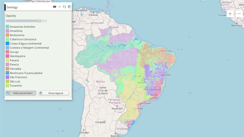
The example below, running in the Mappia calculator - click it to run it live. Full-size picture

  1. Run it

    Click the picture: the map opens right here and runs the example. Nothing is saved, and nothing to install.

  2. Try it
    • Rest the mouse on each button of the Geology row: the tooltips set in paramsButtonConfig appear.
    • Click the “About this map” button: a window describes the published geology map.
    • Click “Show the controls” to close the panel, and click it again to reopen it.
  3. Make it yours

    Copy the query, change it - the key parameters are below - and run it again in the playground, or paste it into the Mappia editor to save it as your map.

Key parameters

ParameterExampleWhat it does
typedownloadWhich button the entry adds or configures: query (the panel), download, metadata, or associated for your own.
pressedtrueOn a query entry, opens the panel when the map loads, instead of the legend.
tooltipDownload this mapThe text shown when the mouse rests on the button.
hideButtontrueHides the button of a query entry.
toggleGroupmain_panelsButtons that share this name act together: opening one layer’s panel closes the others.
handlerfunction (button, clickEvent) { ... }Your own code, run when the button is clicked.

Every parameter, with its type and default, is in the reference at the end of this page.

Complete example

The query 17 lines · runs as is
// Layer panel buttons: paramsButtonConfig chooses the buttons on the layer's row - the query
// panel (where descriptionHtml lives), download and metadata.
[
  {
    title: "Geology",
    name: "CSR:geologia",
    source: "calculate",
    opacity: 0.8,
    visibility: true,
    paramsButtonConfig: [
      { type: "query", pressed: true, tooltip: "Show the controls" },
      { type: "download", tooltip: "Download this map" },
      { type: "metadata", tooltip: "About this map" },
    ],
    descriptionHtml: "{{label|text=The row above holds the layer's buttons: this panel, download and metadata.}}",
  },
];

Customize it

The button types

paramsButtonConfig is a list of entries, and each entry’s type chooses the button. The query entry configures the panel button; list download or metadata to add those buttons to the layer’s row:

typeButton
queryShows or hides the layer’s panel, where its descriptionHtml and widgets live
downloadLets the user download the layer’s data
metadataOpens the published information about the layer’s maps
associatedA row button linked to a button in descriptionHtml

A single object instead of a list counts as one query entry, so paramsButtonConfig: { pressed: true } simply opens the panel at start. An entry without a type inside a list is ignored.

One panel open at a time

Give the query entries of several layers the same toggleGroup: opening one panel closes the others. On the layer itself (outside paramsButtonConfig), toggleGroup means something else: layers that share it are never visible together.

Run your own code

handler(button, clickEvent) runs on a click; toggleHandler(button, state) runs when a toggle button changes state, with state true when pressed.

A row button tied to a panel button

An associated entry adds a button to the row that mirrors a toggle button declared in the panel: pressing one presses the other.

descriptionHtml: "{{button|id=pick_btn|text=Pick a point|enableToggle=true}}",
paramsButtonConfig: [
  { type: "query", pressed: true },
  { type: "associated", associatedButtonID: "pick_btn", tooltip: "Pick a point" },
],

Switches on the layer itself

These go directly on the layer, not inside paramsButtonConfig: hideLegendButton hides the legend, hideMetadata the metadata button, hideStyleChooser the style list of a catalogue layer, showRemoveBtn adds a remove button, startLegendOpen opens the layer’s window at start, and useLayerTooltip: false turns off the layer’s tooltip.

Group rows

A group (a definition with viewTitle and elements) can react to its own row: onClickViewGroup runs when its title is clicked and onToggleViewGroup when it opens or closes. Both receive the group’s row as their first argument, view, and view.expanded tells whether the group is open. On a layer that is not inside a viewTitle group these callbacks never run.

Settings that do nothing

hideBottomButton works only inside a query entry, not on the layer. A per-layer disableDownload is never read: hide download buttons for the whole page with options=disabledownload in the map’s URL (see map tools).
Reference: the parameters used here

Generated from the platform source. Every entry, searchable, is in the API reference; the raw data is api.json. Open an entry for its description, parameters and example; # links to it.

Row buttons (paramsButtonConfig)

paramsButtonConfigProperties8 entries
paramsButtonConfig is a key of calculated, file and tile layers: an array with one object per button on the layer's row (query, legend, download, metadata...). These are the keys of each object; a bare object instead of an array is read as the query button.

enableToggle

Boolean= trueproperty# Makes the row button of a paramsButtonConfig entry that mirrors a widget (an entry with associatedButtonID) a toggle (true) or a plain push button (false).

Makes the row button of a paramsButtonConfig entry that mirrors a widget (an entry with associatedButtonID) a toggle (true) or a plain push button (false). PS: Once the mirrored widget is found the platform sets it from that widget (a checkbox or a toggle button makes it a toggle), so your value only counts while the widget does not exist.

paramsButtonConfig: [{ type: 'associated', associatedButtonID: 'my_button', enableToggle: false }]

hideBottomButton

Boolean= falseproperty# Hides the text buttons at the bottom of the query and legend sections of the Legend Window ("Show query"/"Hide query" and "Show legend"/"Hide legend").

Hides the text buttons at the bottom of the query and legend sections of the Legend Window ("Show query"/"Hide query" and "Show legend"/"Hide legend"). Set it to 'true' to hide them or 'false' to display them. It only works inside a paramsButtonConfig entry of type: 'query' (or in the bare object form of paramsButtonConfig, which is treated as the query entry); a hideBottomButton written directly on the layer or in a group's defaultProperties is ignored.

[
  {
     title: 'Example of paramButtonConfig hideBottomButton property',
     color: '#FFA500',
     elements: [
        {
           title: 'The buttons at the bottom of the Legend Window are hidden',
           name: 'CSR:geologia',
           source: 'calculate',
           visibility: true,
           descriptionHtml:
              '{{label|text=There are no buttons in here}}',
           paramsButtonConfig: [
              {
                 type: 'query',
                 hideBottomButton: false,
              },
           ],
        },
     ],
  },
]

hideButton

Boolean= falseproperty# Define if the associated button should be hidden.

Define if the associated button should be hidden. Set it to 'true' to hide the button or 'false' to show it. This property only applies to the type: 'query'

[
  {
     title: 'Example of paramButtonConfig hideButton property',
     color: '#FFA500',
     elements: [
        {
           title: 'The query button in hidden',
           name: 'CSR:geologia',
           source: 'calculate',
           visibility: true,
           paramsButtonConfig: [
              { 
                 type: 'query',
                 hideButton: true,
              },
           ],
        },
     ],
  },
]

iconCls

String= string.emptyproperty# Define a class that will be added to the html in the associated button.

Define a class that will be added to the html in the associated button.

This class can be one that has a image on it like:

  • 'gxp-icon-togglevisibility' is the icon of the Show/Hide Map Button (The first icon on the Legend Window, from left to right)
  • 'gxp-icon-removelayers' is the icon of the Remove Layer Button (The second icon on the Legend Window, from left to right)
  • 'gxp-icon-parameters-expand' is the icon of the Show Query Button (The third icon on the Legend Window, from left to right)
  • 'gxp-icon-legend-expand' is the icon of the Show Legend Button (The forth icon on the Legend Window, from left to right)
  • 'gxp-icon-downloadmapbutton' is the icon of the Download Button (The fifth icon on the Legend Window, from left to right)
[
  {
     title: 'Example of paramButtonConfig iconCls property',
     color: '#A020F0',
     elements: [
        {
           title: 'The query button is the download icon:',
           name: 'CSR:geologia',
           source: 'calculate',
           visibility: true,
           descriptionHtml:
              '{{label|text=Here is the query region}}',
           paramsButtonConfig: [
              { 
                 type: 'query',
                 tooltip: 'This is actually the query button',
                 // Here you can add any class you choose
                 iconCls: 'gxp-icon-downloadmapbutton',
              },
           ],
        },
     ],
  },
]

pressed

Boolean= falseproperty# Defines if the button should start pressed or not.

Defines if the button should start pressed or not. Set it to 'true' for it to start pressed or 'false' for start unpressed. For example, the 'query' button type set as pressed will display the Query region (where the descriptionHtml content is) by default instead of the Legend region. This property applies only to the types: 'query',

[
  {
     title: 'Example of paramButtonConfig pressed property',
     color: '#A020F0',
     elements: [
        {
           title: 'The param button config set the query button to be pressed at the start',
           name: 'CSR:geologia',
           source: 'calculate',
           visibility: true,
           descriptionHtml:
              '{{label|text=The region of the descriptionHtml will start opened}}',
           paramsButtonConfig: [
              { 
                 type: 'query',
                 pressed: true,
              },
           ],
        },
     ],
  },
]

toggleGroup

String= string.emptyproperty# Defines a group for all the buttons that has the same toggleGroup name.

Defines a group for all the buttons that has the same toggleGroup name. From all the buttons on the same group, only one can be active at each time. Whenever another one is activated the previous one collapses.

[
  {
     title: 'Example of paramButtonConfig toogleGroup',
     color: '#FFA500',
     elements: [
        {
           title: 'Layer 1',
           name: 'CSR:geologia',
           source: 'calculate',
           visibility: true,
           descriptionHtml:
              '{{label|text=This is the description of Layer 1. Only one can be open each time.}}',
           paramsButtonConfig: [
              { 
                 type: 'query',
                 toggleGroup: 'Group1',
              },
           ],
        },
        {
           title: 'Layer 2',
           name: 'CSR:geologia',
           source: 'calculate',
           visibility: true,
           descriptionHtml:
              '{{label|text=This is the description of Layer 2. Only one can be open each time.}}',
           paramsButtonConfig: [
              { 
                 type: 'query',
                 toggleGroup: 'Group1',
              },
           ],
        },
        {
           title: 'Layer 3',
           name: 'CSR:geologia',
           source: 'calculate',
           visibility: true,
           descriptionHtml:
              '{{label|text=This is the description of Layer 3. Only one can be open each time.}}',
           paramsButtonConfig: [
              { 
                 type: 'query',
                 toggleGroup: 'Group1',
              },
           ],
        },
     ],
  },
]

tooltip

String= string.emptyproperty# Defines the help tooltip text that is displayed when the mouse hover the associated button.

Defines the help tooltip text that is displayed when the mouse hover the associated button.

[
  {
     title: 'Example of paramButtonConfig tooltip property',
     color: '#A020F0',
     elements: [
        {
           title: 'The query button is the third of the buttons at the right:',
           name: 'CSR:geologia',
           source: 'calculate',
           visibility: true,
           descriptionHtml:
              '{{label|text=Hover the query button. That is the third button from left to right.}}',
           paramsButtonConfig: [
              { 
                 type: 'query',
                 pressed: true,
              },
           ],
        },
     ],
  },
]

type

String= 'query'property# Define which button will be affected by the configurations.

Define which button will be affected by the configurations. The type can be one of the following:

  • 'query': The query button shows or hides the Query panel (where the descriptionHtml is drawn).

  • 'download': The download button is the one with a downward arrow. This button allows the user to download the dataset. It also defines which Layer should be downloaded when more than one Layer is shown by its internal layer index.

  • 'metadata': The metadata button is the one with a script icon. This button displays a popup with more information about the maps used in the actual Layer. You can make it show one of the inside composite Layer by his index.

  • 'associated': Creates a custom button that is linked to another button defined in the descriptionHtml. When one is pressed the other is also pressed.

paramsButtonConfig is normally an array of entries and each entry must declare its type (an entry without type is ignored). It may also be a single object instead of an array: it is then treated as one entry of type: 'query' (unless the object declares another type). PS: The properties are aditional, so the common must always be present, and for each type his corresponding property must be added.

// Example on how to use the query type paramsButtonConfig
[
  {
     title: 'Example of paramButtonConfig types',
     color: '#FFA500',
     elements: [
        {
           title: 'This Layer has custom buttons on the Legend Window',
           name: 'CSR:geologia',
           source: 'calculate',
           visibility: true,
           startLegendOpen: true,
           descriptionHtml:
              '{{label|text=The third button is the Query type}}',
           paramsButtonConfig: [
              { 
                 type: 'query',
                 tooltip: 'This is the query button',
                 pressed: true,
                 handler: function handleClick(button, clickEvent)  {
                    ExtjsUtils.ALERTIFY.log('You\'ve clicked the query button');
                 },
              },
           ],
        },
     ],
  },
]
// Example on how to use the metadata type paramsButtonConfig 
[
  {
     title: 'Example of paramButtonConfig types',
     color: '#FFA500',
     elements: [
        {
           title: 'This Layer has custom buttons on the Legend Window',
           name: 'CSR:geologia',
           source: 'calculate',
           visibility: true,
           startLegendOpen: true,
           descriptionHtml:
              '{{label|text=The third button is the metadata type}}',
           paramsButtonConfig: [
              { 
                 type: 'query',
                 pressed: true,
              },
              { 
                 type: 'metadata',
                 tooltip: 'This is the metadata button',
                 handler: function handleClick(button, clickEvent)  {
                    ExtjsUtils.ALERTIFY.log('You\'ve clicked the metadata button');
                 },
              },
           ],
        },
     ],
  },
]
// Example on how to use the download type paramsButtonConfig 
[
  {
     title: 'Example of paramButtonConfig types',
     color: '#FFA500',
     elements: [
        {
           title: 'This Layer has custom buttons on the Legend Window',
           name: 'CSR:geologia',
           source: 'calculate',
           visibility: true,
           startLegendOpen: true,
           descriptionHtml:
              '{{label|text=The last  button is the download type}}',
           paramsButtonConfig: [
              { 
                 type: 'query',
                 pressed: true,
              },
              { 
                 type: 'download',
                 tooltip: 'This is the download button',
                 handler: function handleClick(button, clickEvent)  {
                    ExtjsUtils.ALERTIFY.log('You\'ve clicked the download button');
                 },
              },
           ],
        },
     ],
  },
]
// Example on how to use the associated type paramsButtonConfig
[
  {
     title: 'Example of paramButtonConfig types',
     color: '#FFA500',
     elements: [
        {
           title: 'This Layer has custom buttons on the Legend Window',
           name: 'CSR:geologia',
           source: 'calculate',
           visibility: true,
           startLegendOpen: true,
           descriptionHtml:
              '{{label|text=The third button is the associated type}}'
              +
              '{{button|id=test_button|text=This is the custom associated button|enableToggle=true}}',
           paramsButtonConfig: [
              { 
                 type: 'query',
                 pressed: true,
              },
              { 
                 type: 'associated',
                 tooltip: 'This is the custom button',
                 associatedButtonID: 'test_button',
                 // The handler only triggers for the Legend Window button (not the descriptionHtml associatedButton)
                 handler: function handleClick(button, clickEvent)  {
                    ExtjsUtils.ALERTIFY.log('You\'ve clicked the custom button');
                 },
              },
           ],
        },
     ],
  },
]

Row button callbacks

paramsButtonConfigFunctions2 entries
Functions a row-button object can carry; the platform calls them when the button is pressed or toggled.

handler

functioncallback# Defines a function that will be called when the associated button is clicked.

Defines a function that will be called when the associated button is clicked.

button Object
is the button that was clicked by the mouse.
clickEvent MouseEvent
is the object that carries more information about the click event.
[
  {
     title: 'Example of callback when clicking in a Legend Window button',
     color: '#A020F0',
     elements: [
        {
           title: 'The handleClick function will be called when the query button is clicked',
           name: 'CSR:geologia',
           source: 'calculate',
           visibility: true,
           paramsButtonConfig: [
              { 
                 type: 'query',
                 handler: function handleClick(button, clickEvent) {
                    ExtjsUtils.ALERTIFY.log('You clicked the query button');
                 },
              },
           ],
        },
     ],
  },
]

toggleHandler

function= nullcallback# This function is called whenever the associated button change its toggle state.

This function is called whenever the associated button change its toggle state. PS: Using custom function, ignore the associatedButtonID "It doesnt have to even exists".

button Ext.Button
The button element that was clicked
state Boolean
The next state of the button, true means pressed
[
  {
     title: 'Example of paramButtonConfig toogleHandler',
     color: '#FFA500',
     elements: [
        {
           title: 'Layer 1',
           name: 'CSR:geologia',
           source: 'calculate',
           visibility: true,
           paramsButtonConfig: [
              { 
                 type: 'query',
                 toggleHandler: function handleToggle(button, state) {
                    let queryButtonState = state ? 'pressed' : 'unpressed';
                    console.log(`Layer 1 query button is: ${queryButtonState}`);
                 },
              },
           ],
        },
     ],
  },
]

Group callbacks (viewTitle groups)

GroupFunctions2 entries
Functions a viewTitle group can carry; the platform calls them when its heading in the layer panel is clicked or toggled. Inside them this is the heading's node.

onClickViewGroup

function= nullcallback# Called whenever the user clicks the title of a viewTitle group in the Legend Window.

Called whenever the user clicks the title of a viewTitle group in the Legend Window. It belongs on a group that has viewTitle: the handler is bound to that group's tree node, so this is the node and view.expanded tells whether the group is open after the click. When declared on a layer instead of a group, it is attached to the layer's nearest viewTitle ancestor (once per layer that declares it); on a flat layer with no viewTitle ancestor it is bound to the invisible root node, i.e. it never fires.

view Ext.tree.TreeNode
The tree node of the group that was clicked (view.expanded, view.text, view.childNodes).
clickEvent Ext.EventObject
The click event, with details such as the mouse position.
[
  {
     viewTitle: 'Example View (Click me!)',
     viewColor: '#FFA500',
     title: 'Click the view to change its state',
     color: '#666699',
     openGroup: true,
     onClickViewGroup: function handleClickViewGroup(view, clickEvent) {
        let viewState = (view.expanded ? 'open' : 'closed');
        ExtjsUtils.ALERTIFY.log('The ' + view.text + ' is ' + viewState );
     },
     elements: [
        {
           title: 'Layer 1',
           name: 'CSR:estados',
           source: 'local',
           startListed: true,
        },
     ],
  },
]

onToggleViewGroup

function= nullcallback# Called whenever a viewTitle group of the Legend Window is expanded or collapsed (by the user or by code).

Called whenever a viewTitle group of the Legend Window is expanded or collapsed (by the user or by code). It belongs on a group that has viewTitle: the handler is bound to that group's tree node, so this is the node and view.expanded is true after an expand and false after a collapse. When declared on a layer instead of a group, it is attached to the layer's nearest viewTitle ancestor (once per layer that declares it); on a flat layer with no viewTitle ancestor it is bound to the invisible root node, i.e. it never fires. A typical use is hiding the layers of the collapsed group and restoring them on expand.

view Ext.tree.TreeNode
The tree node of the group whose state changed (view.expanded, view.text, view.childNodes).
[
  {
     viewTitle: 'Example View (Click me!)',
     viewColor: '#FFA500',
     title: 'Click the view to change its state',
     color: '#666699',
     openGroup: true,
     onToggleViewGroup: function handleToggleViewGroup(view) {
        let viewState = (view.expanded ? 'open' : 'closed');
        ExtjsUtils.ALERTIFY.log('The ' + view.text + ' is ' + viewState );
     },
     elements: [
        {
           title: 'Layer 1',
           name: 'CSR:estados',
           source: 'local',
           startListed: true,
        },
     ],
  },
]

Layer properties

LayersProperties5 entries
Keys of a layer object: which map it shows (name, source, styles), how it looks (title, opacity, visibility) and how its row and panel behave.

hideLegendButton

Boolean= falseproperty# Hides the legend of the layer in its Legend Window.

Hides the legend of the layer in its Legend Window. Set it to 'true' to hide it, 'false' to display it. It applies to every layer source: on a local layer it hides the "show legend" toggle button of the row; on a calculate, file or xyz layer it hides the generated legend container (with the legend title and the opacity slider) and the "show legend" button at the bottom of the query section, so only the descriptionHtml remains.

[
  {
     title: 'Hiding the Legend Button',
     color: '#FFA500',
     elements: [
        {
           title: 'The Layer Legend Button will be hidden',
           name: 'CSR:geologia',
           source: 'calculate',
           visibility: true,
           hideLegendButton: true,
           descriptionHtml:
              '{{label|text=The legend button is hidden, only the descriptionHtml is visible}}',
        },
     ],
  },
]

hideMetadata

Boolean= falseproperty# If true, hides the metadata button in the Legend Window for this layer.

If true, hides the metadata button in the Legend Window for this layer. The button is also hidden when the link has options=hidemetadata: either one hides it, and hideMetadata: false cannot bring it back. Calculated, file and tile (xyz) layers only have this button when their paramsButtonConfig has a {type: 'metadata'} entry.

[
  {
     title: 'Hiding the metadata button',
     color: '#FFA500',
     elements: [
        {
           title: 'This Layer has no metadata button',
           name: 'CSR:geologia',
           source: 'local',
           visibility: true,
           hideMetadata: true,
        },
     ],
  },
]

hideStyleChooser

Boolean= falseproperty# Define if should hide the Combobox with the map possible styles that can be applied to a map in a Layer that has the 'source' 'local'.

Define if should hide the Combobox with the map possible styles that can be applied to a map in a Layer that has the 'source' 'local'.

[
  {
     title: 'Example with hidden style Combobox',
     color: '#FFA500',
     elements: [
        {
           title: 'Map of the geology in Brazil',
           name: 'CSR:geologia',
           source: 'local',
           visibility: true,
           startLegendOpen: true,
           hideStyleChooser: true,
        },
     ],
  },
]

showRemoveBtn

Boolean= falseproperty# Defines it the remove button at the top right of the Layer Legend Window show be displayed.

Defines it the remove button at the top right of the Layer Legend Window show be displayed. Set it to 'true' to show it. Set it to 'false' to hide it.

[
  {
     title: 'Hiding the remove button',
     color: '#FFA500',
     elements: [
        {
           title: 'The \'X\' button at the top right of this Layer removes this map',
           name: 'CSR:rios_principais',
           source: 'local',
           visibility: true,
        },
        {
           title: 'There is no button to remove the this map',
           name: 'CSR:estados',
           source: 'local',
           visibility: true,
           showRemoveBtn: false,
        },
     ],
  },
]

startLegendOpen

Boolean= falseproperty# Defines if the Legend Window should start or not.

Defines if the Legend Window should start or not. Set it to 'true' to make it start open. Set it to 'false' for it to start closed. Applies to published maps only (no source, source: 'local' or a server added with addRemoteWMSServer). Calculated, file and tile (xyz) layers ignore it: their details already start open, and paramsButtonConfig: [{type: 'query', pressed: true}] makes them start on the layer's panel instead.

[
  {
     title: 'The Legend Window the Layer will start open',
     color: '#FFA500',
     elements: [
        {
           title: 'This Layer Legend Window will start open',
           name: 'CSR:geologia',
           source: 'local',
           startLegendOpen: true,
           visibility: true,
        },
     ],
  },
]

More layer properties

ConfigLayer2 entries
More keys of the same layer object: scale limits, grouping (group, toggleGroup, openGroup), the row's layout and, on calculated layers, how each map is read (operation).
View all layer configuration API here.

toggleGroup

Stringproperty# Places a layer in a group of layers with mutually exclusive visibility.

Places a layer in a group of layers with mutually exclusive visibility.

At most one layer of the same group will be visible, when one is shown, the others will be hidden.

[{name: "CSR:estados": toggleGroup:"political_division"},
{name: "CSR:paises": toggleGroup:"political_division"}
]

useLayerTooltip

Boolean|Numberproperty# If false, the layer tooltip is not shown.

If false, the layer tooltip is not shown. If a number, the layer tooltip is shown for the specified layer. (Only supported for layers with source: "calculate") Otherwise follow tooltip default behavior that varies from map source