Quick start
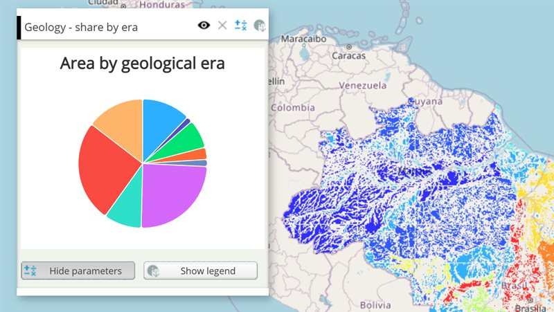
The example below, running in the Mappia calculator - click it to run it live. Full-size picture
- Run it
Click the picture: the map opens right here and runs the example. Nothing is saved, and nothing to install.
- Try it
- Turn the switch off: after the countdown, the soils below 50 Mg/ha appear in yellow beside the brown carbon-rich ones.
- Turn it back on: only the brown soils above 50 Mg/ha remain.
- Make it yours
Copy the query, change it - the key parameters are below - and run it again in the playground, or paste it into the Mappia editor to save it as your map.
- More ways to use it
Key parameters
| Parameter | Example | What it does |
|---|---|---|
handler | onToggle | Function run on every change as handler(checkbox, checked), with this = the layer. Looked up in functions first. |
checked | true | Starts the switch on. The handler does not run for this starting state. |
text | Only soils above 50 Mg/ha | Text shown next to the switch. Change it later with setBoxLabel. |
id | only_rich | Lets your code find the switch: Ext.getCmp('only_rich'). |
toggle | Ext.getCmp('only_rich').toggle(false) | Turns the switch on or off from code and runs the handler, as a click would. Without an argument it flips. |
Every parameter, with its type and default, is in the reference at the end of this page.
Complete example
The query 37 lines · runs as is
// Checkbox: not an input itself. Its handler stores the state in an inputmanager, whose
// plain "global" values are what reach expression() (inputs[0] - checkboxes take no position).
[
  {
    title: "Carbon-rich soils switch",
    name: "CSR:soil_organic_carbon_stock",
    source: "calculate",
    opacity: 0.85,
    visibility: true,
    paramsButtonConfig: [{ type: "query", pressed: true }],
    descriptionHtml:
      "{{checkbox|id=only_rich|text=Only soils above 50 Mg/ha|checked=true|hideLabel=true|handler=onToggle}}" +
      "{{inputmanager|id=state}}",
    functions: {
      // this = the layer; called with the checkbox and its new state
      onToggle: function (checkbox, checked) {
        this.getInputs().id["state"].setValues({ onlyRich: checked }); // recalculates
      },
    },
    onInputsReady: function (inputs) {
      inputs.id["state"].setDefaultValues({ onlyRich: true });
    },
    // The legend shows what the map shows - and changing it is what redraws the map: a change of
    // the inputs that leaves the legend as it was does not. The class always shown is value 1, the
    // optional one comes after it (legend values in ascending order).
    beforeCalc: function (inputs) {
      var legend = [{ color: [121, 85, 72], value: 1, title: "Above 50 Mg/ha" }];
      if (!inputs.id["state"].global.onlyRich) legend.push({ color: [241, 196, 15], value: 2, title: "Below 50 Mg/ha" });
      this.setCalculateLegend(legend);
    },
    expression: function (layersVals, inputs) {
      var onlyRich = inputs[0].global.onlyRich;
      if (layersVals[0] >= 50) return 1;
      return onlyRich ? this.nullValue : 2;
    },
  },
];
More examples
Other ways to use Checkbox, each a complete query that runs as is - like the one above.
Several switches, one filter
Each checkbox turns one class of the map on or off - here dry, moderate and wet places by annual rainfall.
Click the picture to run it live. Full-size picture
The query 47 lines · runs as is
// Several switches, one filter: each checkbox turns one class of the map on or off - here dry, moderate and wet places by annual rainfall.
// Checkboxes are not inputs: one handler writes the state of the checkbox it is called for into an
// inputmanager (setValues merges keys and recalculates), and expression reads the three states.
[
  {
    title: "Rainfall classes",
    name: "CSR:precip_annual_average",
    source: "calculate",
    opacity: 0.85,
    visibility: true,
    paramsButtonConfig: [{ type: "query", pressed: true }],
    descriptionHtml:
      "{{inputmanager|id=classes}}" +
      "{{checkbox|id=show_dry|text=Dry: below 800 mm|checked=true|hideLabel=true|handler=onClassToggle}}" +
      "{{checkbox|id=show_moderate|text=Moderate: 800 to 1200 mm|checked=true|hideLabel=true|handler=onClassToggle}}" +
      "{{checkbox|id=show_wet|text=Wet: above 1200 mm|checked=true|hideLabel=true|handler=onClassToggle}}",
    functions: {
      // this = the layer; the checkbox's id names the class it switches
      onClassToggle: function (checkbox, checked) {
        var values = {};
        values[checkbox.id.replace("show_", "")] = checked;
        this.getInputs().id["classes"].setValues(values);
      },
    },
    onInputsReady: function (inputs) {
      inputs.id["classes"].setDefaultValues({ dry: true, moderate: true, wet: true });
    },
    // The legend lists only the classes shown. That also makes the layer recalculate: a change of
    // the inputs that leaves the legend as it was does not redraw the map.
    beforeCalc: function (inputs) {
      var show = inputs.id["classes"].global;
      var legend = [];
      if (show.dry) legend.push({ color: [230, 160, 40], value: 1, title: "Dry (below 800 mm)" });
      if (show.moderate) legend.push({ color: [120, 180, 90], value: 2, title: "Moderate (800 - 1200 mm)" });
      if (show.wet) legend.push({ color: [40, 110, 190], value: 3, title: "Wet (above 1200 mm)" });
      this.setCalculateLegend(legend);
    },
    expression: function (layersVals, inputs) {
      var show = inputs[0].global; // the inputmanager: the only input
      var rainfall = layersVals[0];
      if (!this.isNumeric(rainfall)) return this.nullValue;
      var rainClass = rainfall < 800 ? 1 : rainfall <= 1200 ? 2 : 3;
      var shown = rainClass === 1 ? show.dry : rainClass === 2 ? show.moderate : show.wet;
      return shown ? rainClass : this.nullValue;
    },
  },
];
Customize it
Make the state reach the calculation
A checkbox is not an input: its state never reaches expression by itself, and it takes no position in inputs. The example uses the usual three steps:
- The handler stores the state in an InputManager with
setValues, which also recalculates the layer. onInputsReadycallssetDefaultValueswith the same state aschecked=true, because the handler does not run for the starting state.expressionreads the stored value by the manager’s position:inputs[0].global.onlyRich.
Use it without a calculation
The handler can do anything on the page, for example show or hide another layer of the map:
descriptionHtml: "{{checkbox|id=show_states|text=Show state borders|handler=onShowStates}}",
functions: {
  onShowStates: function (checkbox, checked) {
    /* on the map a plain layer is named by its title: find it by the map it shows */
    this.map.layers.forEach(function (layer) {
      if (layer.params && layer.params.LAYERS === "CSR:estados") layer.setVisibility(checked);
    });
  },
},
Change its look
labelBefore=trueputs the text before the switch instead of after it.fieldLabeladds a label at the left of the whole field;hideLabel=trueremoves it.iconClsreplaces the CSS class of the switch icon, to restyle it.Ext.getCmp(id).setBoxLabel("Show details (3)")changes the text after the map opened.
Pitfalls
- The handler also runs once with
checked = falsewhen the layer is removed. Undo there whatever turning it on did. - Write the handler as a regular
function, not an arrow function, orthisis not the layer. notifyandunselectare accepted for symmetry with the map-picking switches, but do nothing on a plain checkbox.