Fip Cerrado project
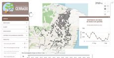
Display fire risks in the Cerrado biome.
Reference: the parameters used here
Generated from the platform source. Every entry, searchable, is in the API reference; the raw data is api.json. Open an entry for its description, parameters and example; # links to it.
timeline · scenarios over time (input)
Timeline31 entriesWritten in a layer's descriptionHtml as {{timeline|parameter=value|...}}
fieldLabel
String# Defines a label for the Timeline.
fieldLabelDefines a label for the Timeline. It will be shown at the left of the button to hide the tiemline, by default.
|fieldLabel=This is the field label|getCurrentLayerStyle
function() : String# Returns the WMS style currently applied to the layer (layer.params.STYLES), or an empty string for the default style.
getCurrentLayerStyleReturns the WMS style currently applied to the layer (layer.params.STYLES), or an empty string for the default style.
Returns The active style name.
var style = Ext.getCmp('years_tl').getTimeline().getCurrentLayerStyle();getDesiredVisibility
function() : Boolean# Returns the visibility the timeline has, or will have when its layer becomes visible: true may be returned while the panel is actually hidden because the layer is hidden.
getDesiredVisibilityReturns the visibility the timeline has, or will have when its layer becomes visible: true may be returned while the panel is actually hidden because the layer is hidden.
Returns true when the timeline is (or will be) shown together with the layer.
var shown = Ext.getCmp('years_tl').getTimeline().getDesiredVisibility();getMainThumb
function() : Ext.slider.Thumb# Returns the main (middle) thumb of the slider — the one that selects the current step; its value is the 0-based step index.
getMainThumbReturns the main (middle) thumb of the slider — the one that selects the current step; its value is the 0-based step index. The outer thumbs (thumbs[0], thumbs[2]) bound the animation range.
Returns The main thumb; read the step index from .value.
var stepIndex = Ext.getCmp('years_tl').getTimeline().getMainThumb().value;getMaxThumbValue
function() : Number# Returns the position of the right (max) thumb: the last step index the animation reaches.
getMaxThumbValueReturns the position of the right (max) thumb: the last step index the animation reaches.
Returns 0-based step index of the max thumb.
var last = Ext.getCmp('years_tl').getTimeline().getMaxThumbValue();getMinThumbValue
function() : Number# Returns the position of the left (min) thumb: the step index the animation restarts from.
getMinThumbValueReturns the position of the left (min) thumb: the step index the animation restarts from.
Returns 0-based step index of the min thumb.
var first = Ext.getCmp('years_tl').getTimeline().getMinThumbValue();getStyleFromValue
function(value) : String|Object|undefined# Returns the style of a step key or, when the key has no style of its own, the style of the nearest previous key (numeric keys are compared as numbers, text keys by position in steps).
getStyleFromValueReturns the style of a step key or, when the key has no style of its own, the style of the nearest previous key (numeric keys are compared as numbers, text keys by position in steps).
- value String|Number
- A step key.
Returns The style (name or {style, name} object), or undefined when no previous step has one.
var style = Ext.getCmp('years_tl').getTimeline().getStyleFromValue('2014');getTimeline
function() : GeoExt.TimelinePanel# Returns the timeline panel driven by this button.
getTimelineReturns the timeline panel driven by this button. The markup id identifies the button, so this is the way to reach the panel methods (getValue, updateMainThumbValue, startAnimationStep, setSteps...).
Returns The timeline panel (null after the button was destroyed).
var timeline = Ext.getCmp('years_tl').getTimeline();
timeline.updateMainThumbValue(0); // first step
getValue
function() : String# Returns the key of the step currently selected by the main thumb (the same value the layer receives in inputs.id[ID]).
getValueReturns the key of the step currently selected by the main thumb (the same value the layer receives in inputs.id[ID]).
Returns The current step key (first element of the steps entry).
var year = Ext.getCmp('years_tl').getTimeline().getValue(); // '2010'getValueFromStyle
function(style) : Number# Returns the step key whose style is the given one (the last match when several steps share a style), or the first step key when the style is empty or unknown.
getValueFromStyleReturns the step key whose style is the given one (the last match when several steps share a style), or the first step key when the style is empty or unknown. The key is returned through parseInt, so it is meaningful for numeric keys only (text keys give NaN).
- style String
- A style name as used in
steps.
Returns The numeric step key.
var year = Ext.getCmp('years_tl').getTimeline().getValueFromStyle('style_2010'); // 2010hidden
Boolean= false# Set true to hide the "Show/Hide timeline" button rendered in the layer description (the standard Ext hidden config, so Ext.getCmp(id).show() reveals it).
hiddenSet true to hide the "Show/Hide timeline" button rendered in the layer description (the standard Ext hidden config, so Ext.getCmp(id).show() reveals it). The timeline panel itself is still created and its initial visibility follows renderHidden; use it when the timeline is driven by a paramsButtonConfig button or by code instead. Any other Ext.Button config is passed through.
|hidden=true|hideLabel
Boolean= false# Defines if the label of the timeline should be displayed.
hideLabelDefines if the label of the timeline should be displayed. Set true to hide the label, false to show it.
|hideLabel=true|id
String# Defines the id to identify the object.
idDefines the id to identify the object. It is the key used in inputs.id[ID] and the id of the show/hide button component: Ext.getCmp(id) returns the button and Ext.getCmp(id).getTimeline() the timeline panel (see the methods listed in this group).
|id=exemple_timeline|nextAnimationStep
function()# Advances the timeline one step (main thumb + 1), applying the style of the new step to the layer and firing change; does nothing when the main thumb is already at the max thumb.
nextAnimationStepAdvances the timeline one step (main thumb + 1), applying the style of the new step to the layer and firing change; does nothing when the main thumb is already at the max thumb. Useful for a custom "next" button.
Ext.getCmp('years_tl').getTimeline().nextAnimationStep();nextStepInterval
Number= 2100# Defines the duration of the interval between steps of the timeline in milliseconds.
nextStepIntervalDefines the duration of the interval between steps of the timeline in milliseconds.
|nextStepInterval=1000|onPlayToggle
function# Defines the callback function called when the play/stop button is toggled, BEFORE the animation starts or stops.
onPlayToggleDefines the callback function called when the play/stop button is toggled, BEFORE the animation starts or stops. It must return a truthy value: returning false/nothing cancels the start/stop (use it as a veto, e.g. while data is loading). pressed is true when the animation is about to start.
The value is resolved as a key of the layer functions object, then as a global function with that name, then as inline function text (function(...){...}; a plain statement body also works and returns true).
- pressed Boolean
- True if the button was pressed (animation about to start), False otherwise.
- layer Object
- The layer associated to this timeline.
- timeline Object
- The timeline panel.
- playBtn Object
- The play/stop button.
|onPlayToggle=onPlayToggle||onPlayToggle = function (pressed, layer, timeline, playBtn) {
console.log("The timeline is about to " + (pressed ? "start" : "stop"));
return true; // required, a falsy return cancels the toggle
}|playing
Boolean= false# true while the animation is running (between play and stop/end).
playingtrue while the animation is running (between play and stop/end). Read it on the panel (Ext.getCmp(id).getTimeline().playing) to know whether to call startAnimationStep() or stopAnimation().
if (!Ext.getCmp('years_tl').getTimeline().playing) Ext.getCmp('years_tl').getTimeline().startAnimationStep();preloadTiles
Boolean= false# Defines if the timeline should preload the tiles of the next steps to get smoother transitions.
preloadTilesDefines if the timeline should preload the tiles of the next steps to get smoother transitions. Set it true to preload, false otherwise.
|preloadTiles = true|renderHidden
Boolean= false# Defines the timeline initial visibility.
renderHiddenDefines the timeline initial visibility. Set it true to start with the timeline hidden, false otherwise.
|renderHidden = true|setCurrentLayerStyle
function(style)# Applies a style to the layer the way a step does: a style name, or a {style, name} object that also switches the WMS layer name (the object form of a steps entry).
setCurrentLayerStyleApplies a style to the layer the way a step does: a style name, or a {style, name} object that also switches the WMS layer name (the object form of a steps entry). For a composed layer the first inner layer is updated and the legend is rebuilt. The slider is not moved (use updateMainThumbValue).
- style String|Object
- Style name (
''for the default) or{style: 'name', name: 'CSR:layer'}.
Ext.getCmp('years_tl').getTimeline().setCurrentLayerStyle({style: 'estados_2', name: 'CSR:estados'});setDesiredVisibility
function(visible) : GeoExt.TimelinePanel# Shows or hides the timeline panel while keeping it consistent with the layer: when the layer is hidden the panel stays hidden and the requested state is remembered, to be applied as soon as the layer becomes visible.
setDesiredVisibilityShows or hides the timeline panel while keeping it consistent with the layer: when the layer is hidden the panel stays hidden and the requested state is remembered, to be applied as soon as the layer becomes visible. Prefer it over show()/hide(); the show/hide button follows the panel automatically.
- visible Boolean
trueto show the timeline (once the layer is visible),falseto hide it.
Returns The panel, for chaining.
Ext.getCmp('years_tl').getTimeline().setDesiredVisibility(true);setMaxThumbValue
function(value)# Moves the right (max) thumb, limiting the animation to the steps up to that index (no animation, no change event).
setMaxThumbValueMoves the right (max) thumb, limiting the animation to the steps up to that index (no animation, no change event).
- value Number
- 0-based step index for the max thumb.
Ext.getCmp('years_tl').getTimeline().setMaxThumbValue(5);setMinThumbValue
function(value)# Moves the left (min) thumb, making the animation start from that step index (no animation, no change event).
setMinThumbValueMoves the left (min) thumb, making the animation start from that step index (no animation, no change event).
- value Number
- 0-based step index for the min thumb.
Ext.getCmp('years_tl').getTimeline().setMinThumbValue(2);setSteps
function(steps)# Replaces the steps of the timeline and redraws it (labels, slider range and current step).
setStepsReplaces the steps of the timeline and redraws it (labels, slider range and current step). Unlike the markup steps parameter this takes the already-built object: keys are the step labels, values the style name or a {style, name} object. Use it to change the available periods at runtime (e.g. after a combobox selection).
- steps Object
- Map of step key to style:
{'1990': 'style_1990', '2000': {style: 's2000', name: 'CSR:layer'}}.
Ext.getCmp('years_tl').getTimeline().setSteps({2000: 'style_2000', 2010: 'style_2010'});startAnimationStep
function()# Starts (or resumes) the animation from the current step: each step is shown for nextStepInterval milliseconds after the layer finished loading it, up to the max thumb, where the animation stops by itself.
startAnimationStepStarts (or resumes) the animation from the current step: each step is shown for nextStepInterval milliseconds after the layer finished loading it, up to the max thumb, where the animation stops by itself. When the main thumb is already at the max thumb it restarts from the min thumb. Same as pressing the play button, except that onPlayToggle is not consulted.
Ext.getCmp('years_tl').getTimeline().startAnimationStep();steps
Array.<Array.<(String|Object)>># Defines the timeline change steps.
stepsDefines the timeline change steps.
|steps=[["step_0"], ["step_1"], ["step_2"]]||steps=[['Nome', {style:"step_0_style",name:"CSR:estados"}], ['Região', {style:"step_1_style",name:"CSR:estados"}], ['Geocódigo', {style:"step_2_style",name:"CSR:estados"}]]||steps=[['Nome', 'step_0'], ['Região', 'step_1'], ['Geocódigo', 'step_2']]||steps=[{1990: "layer_style0", 1991: "layer_style1", 1992: "layer_style2"}, 1993: "layer_style3"}]|stopAnimation
function()# Stops the running animation (cancels the pending step timer, releases the play button and hides the slider tip).
stopAnimationStops the running animation (cancels the pending step timer, releases the play button and hides the slider tip). The current step is kept. Safe to call when nothing is playing.
Ext.getCmp('years_tl').getTimeline().stopAnimation();toggleTimelineVisibility
function(forceState)# Shows or hides the timeline panel from code — what clicking the button does.
toggleTimelineVisibilityShows or hides the timeline panel from code — what clicking the button does. Without an argument the current (desired) visibility is inverted. The panel only appears while the layer is visible; the requested state is remembered otherwise (see setDesiredVisibility).
- forceState Boolean
trueto show the timeline,falseto hide it; omit to invert.
Ext.getCmp('years_tl').toggleTimelineVisibility(true);updateLayer
function(value)# Applies to the layer the style of a step key, without moving the slider.
updateLayerApplies to the layer the style of a step key, without moving the slider. When the key has no step of its own the style of the nearest previous numeric key is used (steps {2010: "s1", 2015: "s2"} and value 2014 keep/apply "s1"); nothing happens when that style is already active. Called by the slider on every change; call it yourself to preview a step, then updateMainThumbValue() to sync the thumb.
- value String|Number
- A step key (first element of a
stepsentry).
Ext.getCmp('years_tl').getTimeline().updateLayer('2010');updateMainThumbValue
function(value)# Moves the main thumb to a step index (0-based position in steps), applying that step's style to the layer and firing change — the programmatic way to select a step.
updateMainThumbValueMoves the main thumb to a step index (0-based position in steps), applying that step's style to the layer and firing change — the programmatic way to select a step. Without an argument it re-syncs the thumb with the layer's current style using getValueFromStyle (used when another tool changes the style). The min/max thumbs are pushed outwards when the index falls outside the current range.
- value Number
- Step index; omit to sync the thumb with the layer's current style.
Ext.getCmp('years_tl').getTimeline().updateMainThumbValue(2); // third stepvalue
String# Value stored in inputs.id[ID] (and inputs[i]): the key of the current step — the first element of the selected steps entry (e.g. "1990" or "January"), as a string.
valueValue stored in inputs.id[ID] (and inputs[i]): the key of the current step — the first element of the selected steps entry (e.g. "1990" or "January"), as a string. It changes whenever the main thumb moves (drag, click or animation) and the layer recalculates on the widget change event, after the layer style of the step was applied. The same change event is fired on the button (Ext.getCmp(id).on('change', function(button, value) {...})).
{{timeline|id=years_tl|nextStepInterval=1500|steps=[['1990', 'style_1990'], ['2000', 'style_2000'], ['2010', 'style_2010']]}}beforeCalc: function(inputs) {
var year = parseInt(inputs.id['years_tl'], 10);
}QUERY · setup calls and the running query
QUERY1 entrysetQueryGlobalProperties
function(globalProperties) : Booleanhelper# Defines globals for the query: every key of globalProperties becomes a window property (a value, an object or a function) that layer definitions, markup widgets (handler=, onMark=...) and …
setQueryGlobalPropertiesWritten as ExtjsUtils.QUERY.setQueryGlobalProperties
Defines globals for the query: every key of globalProperties becomes a window property (a value, an object or a function) that layer definitions, markup widgets (handler=, onMark=...) and other query code can reference by name. The names are recorded and the globals are deleted when another query loads. A key that already exists on window and was not created by the query is refused with "Global variable can't be redefined" in the console (the platform's own globals are protected; redefining one of the query's own keys is fine). runNow is the only key the platform itself invokes: right after the globals are registered QUERY.runNow is called once (see that entry). Chain it with && before the layer array so the globals exist when the layers are evaluated; QUERY_DESCRIPTION in the examples stands for that array.
- globalProperties Object
- Object whose keys become globals; each value may be a value, an object or a function.
Returns Always true, so the call can be chained with && QUERY_DESCRIPTION.
ExtjsUtils.QUERY.setQueryGlobalProperties({
  globalCount: 0,
  onLayerButton: function(btn) { console.log("clicked", btn); },
  runNow: function() { ExtjsUtils.ZOOM.limitZoomLevel(17); }
}) && [
  { name: "CSR:estados", visibility: true, descriptionHtml: "{{button|id=b1|text=Go|handler=onLayerButton}}" }
]
inputmanager · values kept for your functions (input)
InputManager6 entriesWritten in a layer's descriptionHtml as {{inputmanager|parameter=value|...}}
PS: DOM elements cannot be used in 'expression' context, because them cannot be sent to WebWorkers (javascript language limitation).
Usage: '{{inputmanager}}'
forceRecalc
function()# Force a legend map recalculation.
forceRecalcForce a legend map recalculation.
getValue
function(key) : *# Get the stored value by his property name, if it does not exists returns null.
getValueGet the stored value by his property name, if it does not exists returns null.
- key String
- Stored property name.
Returns Desired stored property when it exists or null otherwise.
id
String# Defines the id of the input; it is the key used to reach the manager in inputs.id[ID] (required, the tool renders nothing visible).
idDefines the id of the input; it is the key used to reach the manager in inputs.id[ID] (required, the tool renders nothing visible).
|id=state|setDefaultValues
function(obj, local)# Set default values to the stored elements, these values are used before any other value is defined and never update or replace another stored values.
setDefaultValuesSet default values to the stored elements, these values are used before any other value is defined and never update or replace another stored values.
PS: Auxiliary function to make easy wrinting the script (typically called in onInputsReady or at the start of beforeCalc). PS: This function never fire layer update.
- obj Object
- Default values properties.
- local Boolean
- True when the properties should be store locally (and not sent to expression WebWorkers callbacks).
inputs.id['state'].setDefaultValues({year: 2020, scenario: 'base'});setValues
function(obj, cancelUpdate, local)# Stores object properties for later usage.
setValuesStores object properties for later usage.
PS: If has name property collision the older is replaced. PS: Values go to one of two buckets of the manager: global (the default — serialized and sent to expression, so it must hold plain JSON-compatible data) or _local_ (with local=true — kept in the browser only, may hold DOM elements, Ext components, functions or circular objects). getValue(key) looks in global first, then in _local_.
- obj Object
- Object with the properties to be stored.
- cancelUpdate Boolean
- False if this change must cause layer recalculation, True otherwise.
- local Boolean
- True to store the property locally, False otherwise. The local properties aren't sent to 'expression' calbacks. (i.e. If a element is recursive or have DOM elements, it must local avoid stringify errors on 'expression' callbacks)
inputs.id['state'].setValues({year: 2020}); // recalculates the layerinputs.id['state'].setValues({lastInterval: cur}, true, true); // silent, browser-onlyvalue
Object# Value stored in inputs.id[ID]: the manager object itself, with getValue(key), setValues(obj, cancelUpdate, local), setDefaultValues(obj, local) and forceRecalc() (listed in this group) and …
valueValue stored in inputs.id[ID]: the manager object itself, with getValue(key), setValues(obj, cancelUpdate, local), setDefaultValues(obj, local) and forceRecalc() (listed in this group) and the global bucket where the stored properties live (inputs.id[ID].global.key is a shortcut for getValue). The layer recalculates on its own change event, which setValues (unless cancelled) and forceRecalc trigger. Only the global bucket reaches expression (WebWorker); values stored with local=true are kept in a bucket that is not serialized and can therefore hold DOM/Ext references.
{{inputmanager|id=state}}beforeCalc: function(inputs) {
var year = inputs.id['state'].getValue('year') || 2020;
}Row buttons (paramsButtonConfig)
paramsButtonConfigProperties8 entriesenableToggle
Boolean= trueproperty# Makes the row button of a paramsButtonConfig entry that mirrors a widget (an entry with associatedButtonID) a toggle (true) or a plain push button (false).
enableToggleMakes the row button of a paramsButtonConfig entry that mirrors a widget (an entry with associatedButtonID) a toggle (true) or a plain push button (false). PS: Once the mirrored widget is found the platform sets it from that widget (a checkbox or a toggle button makes it a toggle), so your value only counts while the widget does not exist.
paramsButtonConfig: [{ type: 'associated', associatedButtonID: 'my_button', enableToggle: false }]hideBottomButton
Boolean= falseproperty# Hides the text buttons at the bottom of the query and legend sections of the Legend Window ("Show query"/"Hide query" and "Show legend"/"Hide legend").
hideBottomButtonHides the text buttons at the bottom of the query and legend sections of the Legend Window ("Show query"/"Hide query" and "Show legend"/"Hide legend"). Set it to 'true' to hide them or 'false' to display them. It only works inside a paramsButtonConfig entry of type: 'query' (or in the bare object form of paramsButtonConfig, which is treated as the query entry); a hideBottomButton written directly on the layer or in a group's defaultProperties is ignored.
[
  {
     title: 'Example of paramButtonConfig hideBottomButton property',
     color: '#FFA500',
     elements: [
        {
           title: 'The buttons at the bottom of the Legend Window are hidden',
           name: 'CSR:geologia',
           source: 'calculate',
           visibility: true,
           descriptionHtml:
              '{{label|text=There are no buttons in here}}',
           paramsButtonConfig: [
              {
                 type: 'query',
                 hideBottomButton: false,
              },
           ],
        },
     ],
  },
]
hideButton
Boolean= falseproperty# Define if the associated button should be hidden.
hideButtonDefine if the associated button should be hidden. Set it to 'true' to hide the button or 'false' to show it. This property only applies to the type: 'query'
[
  {
     title: 'Example of paramButtonConfig hideButton property',
     color: '#FFA500',
     elements: [
        {
           title: 'The query button in hidden',
           name: 'CSR:geologia',
           source: 'calculate',
           visibility: true,
           paramsButtonConfig: [
              {
                 type: 'query',
                 hideButton: true,
              },
           ],
        },
     ],
  },
]
iconCls
String= string.emptyproperty# Define a class that will be added to the html in the associated button.
iconClsDefine a class that will be added to the html in the associated button.
This class can be one that has a image on it like:
- 'gxp-icon-togglevisibility' is the icon of the Show/Hide Map Button (The first icon on the Legend Window, from left to right)
- 'gxp-icon-removelayers' is the icon of the Remove Layer Button (The second icon on the Legend Window, from left to right)
- 'gxp-icon-parameters-expand' is the icon of the Show Query Button (The third icon on the Legend Window, from left to right)
- 'gxp-icon-legend-expand' is the icon of the Show Legend Button (The forth icon on the Legend Window, from left to right)
- 'gxp-icon-downloadmapbutton' is the icon of the Download Button (The fifth icon on the Legend Window, from left to right)
[
  {
     title: 'Example of paramButtonConfig iconCls property',
     color: '#A020F0',
     elements: [
        {
           title: 'The query button is the download icon:',
           name: 'CSR:geologia',
           source: 'calculate',
           visibility: true,
           descriptionHtml:
              '{{label|text=Here is the query region}}',
           paramsButtonConfig: [
              {
                 type: 'query',
                 tooltip: 'This is actually the query button',
                 // Here you can add any class you choose
                 iconCls: 'gxp-icon-downloadmapbutton',
              },
           ],
        },
     ],
  },
]
pressed
Boolean= falseproperty# Defines if the button should start pressed or not.
pressedDefines if the button should start pressed or not. Set it to 'true' for it to start pressed or 'false' for start unpressed. For example, the 'query' button type set as pressed will display the Query region (where the descriptionHtml content is) by default instead of the Legend region. This property applies only to the types: 'query',
[
  {
     title: 'Example of paramButtonConfig pressed property',
     color: '#A020F0',
     elements: [
        {
           title: 'The param button config set the query button to be pressed at the start',
           name: 'CSR:geologia',
           source: 'calculate',
           visibility: true,
           descriptionHtml:
              '{{label|text=The region of the descriptionHtml will start opened}}',
           paramsButtonConfig: [
              {
                 type: 'query',
                 pressed: true,
              },
           ],
        },
     ],
  },
]
toggleGroup
String= string.emptyproperty# Defines a group for all the buttons that has the same toggleGroup name.
toggleGroupDefines a group for all the buttons that has the same toggleGroup name. From all the buttons on the same group, only one can be active at each time. Whenever another one is activated the previous one collapses.
[
  {
     title: 'Example of paramButtonConfig toogleGroup',
     color: '#FFA500',
     elements: [
        {
           title: 'Layer 1',
           name: 'CSR:geologia',
           source: 'calculate',
           visibility: true,
           descriptionHtml:
              '{{label|text=This is the description of Layer 1. Only one can be open each time.}}',
           paramsButtonConfig: [
              {
                 type: 'query',
                 toggleGroup: 'Group1',
              },
           ],
        },
        {
           title: 'Layer 2',
           name: 'CSR:geologia',
           source: 'calculate',
           visibility: true,
           descriptionHtml:
              '{{label|text=This is the description of Layer 2. Only one can be open each time.}}',
           paramsButtonConfig: [
              {
                 type: 'query',
                 toggleGroup: 'Group1',
              },
           ],
        },
        {
           title: 'Layer 3',
           name: 'CSR:geologia',
           source: 'calculate',
           visibility: true,
           descriptionHtml:
              '{{label|text=This is the description of Layer 3. Only one can be open each time.}}',
           paramsButtonConfig: [
              {
                 type: 'query',
                 toggleGroup: 'Group1',
              },
           ],
        },
     ],
  },
]
tooltip
String= string.emptyproperty# Defines the help tooltip text that is displayed when the mouse hover the associated button.
tooltipDefines the help tooltip text that is displayed when the mouse hover the associated button.
[
  {
     title: 'Example of paramButtonConfig tooltip property',
     color: '#A020F0',
     elements: [
        {
           title: 'The query button is the third of the buttons at the right:',
           name: 'CSR:geologia',
           source: 'calculate',
           visibility: true,
           descriptionHtml:
              '{{label|text=Hover the query button. That is the third button from left to right.}}',
           paramsButtonConfig: [
              {
                 type: 'query',
                 pressed: true,
              },
           ],
        },
     ],
  },
]
type
String= 'query'property# Define which button will be affected by the configurations.
typeDefine which button will be affected by the configurations. The type can be one of the following:
'query': The query button shows or hides the Query panel (where the descriptionHtml is drawn).
'download': The download button is the one with a downward arrow. This button allows the user to download the dataset. It also defines which Layer should be downloaded when more than one Layer is shown by its internal layer index.
'metadata': The metadata button is the one with a script icon. This button displays a popup with more information about the maps used in the actual Layer. You can make it show one of the inside composite Layer by his index.
'associated': Creates a custom button that is linked to another button defined in the descriptionHtml. When one is pressed the other is also pressed.
paramsButtonConfig is normally an array of entries and each entry must declare its type (an entry without type is ignored). It may also be a single object instead of an array: it is then treated as one entry of type: 'query' (unless the object declares another type). PS: The properties are aditional, so the common must always be present, and for each type his corresponding property must be added.
// Example on how to use the query type paramsButtonConfig
[
  {
     title: 'Example of paramButtonConfig types',
     color: '#FFA500',
     elements: [
        {
           title: 'This Layer has custom buttons on the Legend Window',
           name: 'CSR:geologia',
           source: 'calculate',
           visibility: true,
           startLegendOpen: true,
           descriptionHtml:
              '{{label|text=The third button is the Query type}}',
           paramsButtonConfig: [
              {
                 type: 'query',
                 tooltip: 'This is the query button',
                 pressed: true,
                 handler: function handleClick(button, clickEvent)  {
                    ExtjsUtils.ALERTIFY.log('You\'ve clicked the query button');
                 },
              },
           ],
        },
     ],
  },
]
// Example on how to use the metadata type paramsButtonConfig
[
{
title: 'Example of paramButtonConfig types',
color: '#FFA500',
elements: [
{
title: 'This Layer has custom buttons on the Legend Window',
name: 'CSR:geologia',
source: 'calculate',
visibility: true,
startLegendOpen: true,
descriptionHtml:
'{{label|text=The third button is the metadata type}}',
paramsButtonConfig: [
{
type: 'query',
pressed: true,
},
{
type: 'metadata',
tooltip: 'This is the metadata button',
handler: function handleClick(button, clickEvent) {
ExtjsUtils.ALERTIFY.log('You\'ve clicked the metadata button');
},
},
],
},
],
},
]// Example on how to use the download type paramsButtonConfig
[
{
title: 'Example of paramButtonConfig types',
color: '#FFA500',
elements: [
{
title: 'This Layer has custom buttons on the Legend Window',
name: 'CSR:geologia',
source: 'calculate',
visibility: true,
startLegendOpen: true,
descriptionHtml:
'{{label|text=The last button is the download type}}',
paramsButtonConfig: [
{
type: 'query',
pressed: true,
},
{
type: 'download',
tooltip: 'This is the download button',
handler: function handleClick(button, clickEvent) {
ExtjsUtils.ALERTIFY.log('You\'ve clicked the download button');
},
},
],
},
],
},
]// Example on how to use the associated type paramsButtonConfig
[
{
title: 'Example of paramButtonConfig types',
color: '#FFA500',
elements: [
{
title: 'This Layer has custom buttons on the Legend Window',
name: 'CSR:geologia',
source: 'calculate',
visibility: true,
startLegendOpen: true,
descriptionHtml:
'{{label|text=The third button is the associated type}}'
+
'{{button|id=test_button|text=This is the custom associated button|enableToggle=true}}',
paramsButtonConfig: [
{
type: 'query',
pressed: true,
},
{
type: 'associated',
tooltip: 'This is the custom button',
associatedButtonID: 'test_button',
// The handler only triggers for the Legend Window button (not the descriptionHtml associatedButton)
handler: function handleClick(button, clickEvent) {
ExtjsUtils.ALERTIFY.log('You\'ve clicked the custom button');
},
},
],
},
],
},
]Layer properties
LayersProperties1 entryvisibility
Boolean= falseproperty# Define if the Layer should start visible or not.
visibilityDefine if the Layer should start visible or not. Set it to 'true' for the Layer start visible. Otherwise, set it to 'false' and the Layer will start hidden.
[
 {
   title: 'Example of visibility in a Layer',
   color: '#666699',
   elements: [
     {
       title: 'This layer will start visible',
       name: 'CSR:geologia',
       source: 'local',
       visibility: true,
     },
   ],
 },
]