Range Slider

Markup: {{slider}}

Quick start

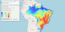
The example below, running in the Mappia calculator - click it to run it live. Full-size picture

  1. Run it

    Click the picture: the map opens right here and runs the example. Nothing is saved, and nothing to install.

  2. Try it
    • Drag the right thumb up to 1500: after the countdown, every place with 800 to 1500 mm of rain a year is blue.
    • Drag the left thumb to 300: the drier places join the band and the legend reads Between 300 and 1500 mm.
  3. Make it yours

    Copy the query, change it - the key parameters are below - and run it again in the playground, or paste it into the Mappia editor to save it as your map.

Key parameters

ParameterExampleWhat it does
values[800,1100]Turns the slider into a range and sets where the two thumbs start. The value becomes a [low, high] array.
idbandNames the pair: inputs.id['band'] in beforeCalc, and by position (inputs[0] here, still an array) inside expression.
minValue300Lowest value either thumb can reach (default 0).
maxValue2100Highest value either thumb can reach (default 100).
increment50Step both thumbs snap to while the user drags them.
width250Width of the slider in pixels. A wider track makes small steps easier to hit.

Every parameter, with its type and default, is in the reference at the end of this page.

Complete example

The query 25 lines · runs as is
// Range slider: two thumbs (values=[low, high]); the slider's value is the [low, high] pair.
// Here it keeps the places whose average annual rainfall falls inside the band.
[
  {
    title: "Rainfall band",
    name: "CSR:precip_annual_average",
    source: "calculate",
    opacity: 0.85,
    visibility: true,
    paramsButtonConfig: [{ type: "query", pressed: true }],
    descriptionHtml:
      "{{label|text=Annual rainfall (mm)}}" +
      "{{slider|id=band|minValue=300|maxValue=2100|increment=50|values=[800,1100]|width=250}}",
    beforeCalc: function (inputs) {
      var band = inputs.id["band"];
      this.setCalculateLegend([
        { color: [41, 128, 185], value: 1, title: "Between " + band[0] + " and " + band[1] + " mm" },
      ]);
    },
    expression: function (layersVals, inputs) {
      var band = inputs[0]; // [low, high]
      return layersVals[0] >= band[0] && layersVals[0] <= band[1] ? 1 : this.nullValue;
    },
  },
];

Customize it

Read the band

The value is always a pair. On the page inputs.id["band"] is [low, high]; inside expression the same pair is inputs[0], so inputs[0][0] is the low end and inputs[0][1] the high end. From any other code, Ext.getCmp("band").getValues() returns the pair.

Show both ends while dragging

The tooltip format of plugins=tip= gets the dragged thumb as {0}, the first thumb as {1} and the second as {2}:

"{{slider|id=band|minValue=300|maxValue=2100|increment=50|values=[800,1100]|plugins=tip={1} to {2} mm|width=250}}"

The other slider options (fieldLabel, hideLabel, disabled, cls…) work as on the Slider page.

Set the band from code

setValue(thumbIndex, value, false, true) moves one thumb and fires the same change as a drag. Index 0 is the low thumb, 1 the high one:

functions: {
  showWettest: function () {
    var band = Ext.getCmp("band");
    band.setValue(1, 2100, false, true);
    band.setValue(0, 1600, false, true);
  },
},

Recalculate without the countdown

After a thumb is released the layer waits about 2.5 seconds, showing a countdown button, before it recalculates. Set updateAutomatically: true on the layer to recalculate right away.

Pitfalls

  • Write values, with an s. value is the starting point of a one-thumb slider.
  • Whether the ends are included is up to your expression: the example keeps both (>= and <=).
  • Inside expression there is no inputs.id; read the pair by position. Legend colours in setCalculateLegend are [R, G, B] arrays, never CSS strings.

Real maps that use it

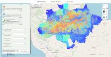
Range Slider Example

Range Slider Example

Range Slider Example

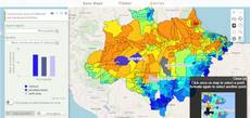
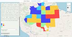
Economic valuation

Economic valuation

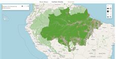
AMAZONES - Timber product

AMAZONES - Timber product

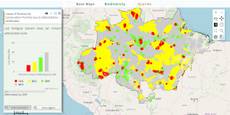
AMAZONES - Biodiversity

AMAZONES - Biodiversity

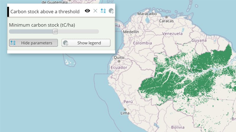
AMAZONES - Carbon stocks and CO2 emissions

AMAZONES - Carbon stocks and CO2 emissions

AMAZONES - Hydrologic services

AMAZONES - Hydrologic services

Reference: every parameter

Generated from the platform source. Every entry, searchable, is in the API reference; the raw data is api.json. Open an entry for its description, parameters and example; # links to it.

slider · number or range (input)

Slider17 entries

Written in a layer's descriptionHtml as {{slider|parameter=value|...}}

Tool that allows users to create a slider that the user can drag and change its value as map input.
View the complete Slider API here.

backgroundColors

Array.<String># Array of colors of background slider values, to define background slider color based in slider value.

Array of colors of background slider values, to define background slider color based in slider value. The values are defined from most to minimum with two properties each:

  • color: {String} CSS color definition for the current interval. i.e. 'red','black','#FF0000', '#000000'.
  • startValue: {Numeric} If defined define the initial value which above will apply this color, otherwise use theminimum slider value as default.

Ex.:
 backgroundColors: [
     {
         // Define background color to red when slider has value above 75.
         color: "red",
         startValue: 75
     },
     {
         // Define background color starting from value 0.
         // That results two intervals, from 0 to 75 as blue, and from 76 to 100 as red.
         color: "blue",
         startValue: 0
     }
 ]

cls

String# Extra CSS class(es) added to the slider element (appended to the default clickable).

Extra CSS class(es) added to the slider element (appended to the default clickable).

|cls=my_slider|

disabled

Boolean= false# Set true to render the slider disabled (Ext disabled); enable it later with Ext.getCmp(id).enable().

Set true to render the slider disabled (Ext disabled); enable it later with Ext.getCmp(id).enable().

|disabled=true|

fieldLabel

String# Defines the label shown at the left of the slider (Ext fieldLabel).

Defines the label shown at the left of the slider (Ext fieldLabel).

|fieldLabel=Deforestation (%)|

getValue

function() : Number# Returns the current value of a single-thumb slider.

Returns the current value of a single-thumb slider. Call it on the component (Ext.getCmp(id) or a getid= reference), not on inputs.id[ID], which already holds the plain value.

Returns The current slider value.

var v = Ext.getCmp('deforestation_slider').getValue();

getValues

function() : Array.<Number># Returns the value of every thumb; use it for range sliders created with values=[lo, hi].

Returns the value of every thumb; use it for range sliders created with values=[lo, hi].

Returns One value per thumb, in thumb order.

var range = Ext.getCmp('interval_slider').getValues(); // [lo, hi]

gradient

Boolean= false# Set true to blend the backgroundColors into a continuous gradient along the filled part of the slider (each colour fading into the next from its startValue).

Set true to blend the backgroundColors into a continuous gradient along the filled part of the slider (each colour fading into the next from its startValue). With the default false each interval is a solid colour, with a short blend only around the thumb. Has no effect without backgroundColors.

|backgroundColors=[{color: "green", startValue: 0}, {color: "red", startValue: 50}]|gradient=true|

hideLabel

Boolean= false# Set true to hide the label and the space reserved for it (Ext hideLabel).

Set true to hide the label and the space reserved for it (Ext hideLabel).

|hideLabel=true|

id

String# Defines the id to identify the object.

Defines the id to identify the object.

|id=example_slider|

increment

Number# Defines the step of each increment or decrement in the actual value of the slider when being dragged.

Defines the step of each increment or decrement in the actual value of the slider when being dragged.

|increment = 10|

maxValue

Number# Defines the maximum value of the slider.

Defines the maximum value of the slider.

|maxValue = 100|

minValue

Number# Defines the minimum value of the slider.

Defines the minimum value of the slider.

|minValue = 0|

setValue

function(value, animate)# Sets the slider value from code.

Sets the slider value from code. Firing the change event (the default) also updates inputs.id[ID] and recalculates the layer. For a range slider pass the thumb index first: setValue(index, value).

value Number
New value (clamped to minValue/maxValue).
animate Boolean
Set false to move the thumb without animation.
Ext.getCmp('deforestation_slider').setValue(20);

thumbStyle

String= null# Defines extra CSS class(es) added to the slider thumb (the draggable handle), to restyle it.

Defines extra CSS class(es) added to the slider thumb (the draggable handle), to restyle it.

|thumbStyle=x-slider-thumb-cut|

value

Number# Defines the initial value of the slider (default 100).

Defines the initial value of the slider (default 100).

At runtime the same value is what inputs.id[ID] (and inputs[i]) holds in beforeCalc/expression: a number, or an array [lower, upper] when the values range form is used. The layer recalculates on the slider change event (thumb released or value set from code).

|value = 100|
beforeCalc: function(inputs) {
    var threshold = inputs.id['deforestation_slider']; // number
}

values

Array.<Number># Defines the slider interval limits.

Defines the slider interval limits. If defined, the slider will be displayed as a range slider. It's return at the 'inputs' parameter will be a array of two values.

|values = [0, 250]|
|beforeCalc: function(inputs) {
   let lowerValue = inputs[0][0]; // The value of the left drag
   let upperValue = inputs[0][1]; // The value of the right drag
}|

width

Number# Defines the slider width in pixels.

Defines the slider width in pixels. Any other Ext.slider.SingleSlider config (cls, fieldLabel, hideLabel, disabled, style, keyIncrement...) is also passed through unchanged.

|width=200|